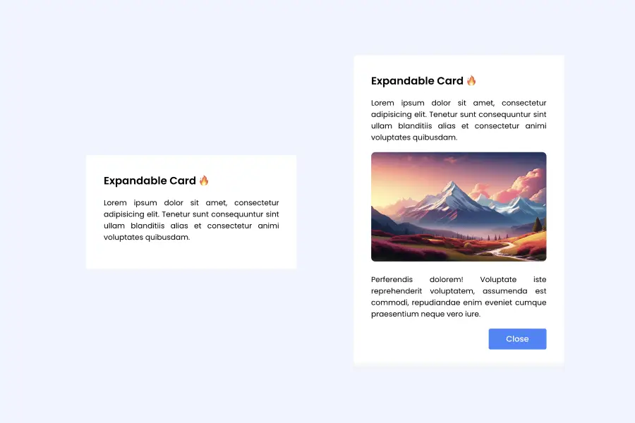
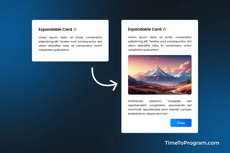
In this short tutorial, we will learn how to create an animated expandable card using framer-motion and React JS. Expandable cards are commonly used in user interfaces to present information in a condensed form initially and allow users to reveal more details when needed. This pattern is useful for displaying additional content or options without overwhelming the user with too much information at once.
In this tutorial, we’ll build a React component named AnimatedCard.jsx. This component represents an expandable card that, when clicked, smoothly reveals additional content, including an image and description. We’ll use Framer Motion to bring our card to life with animated transitions.
Step 1: Installing Framer Motion
Install Framer Motion using npm:
npm install framer-motionStep 2: Create AnimatedCard Component
Let’s start by creating a new file named AnimatedCard.jsx within the “src/components/AnimatedCard/” directory of your React project.
Now, we will write the code for the AnimatedCard component.
// AnimatedCard.jsx

import React, { useState } from "react";
import "./AnimatedCard.css";
import { motion } from "framer-motion";

const AnimatedCard = () => {
  const [isExpaned, setIsExpaned] = useState(false);

  const animated = {
    layout: "position",
    animate: { opacity: 1 },
    transition: { delay: 0.3 },
    initial: { opacity: 0 },
  };

  return (
    <motion.div
      className="card"
      layout
      onClick={() => {
        setIsExpaned(!isExpaned);
      }}
    >
      <motion.h3 layout="position">Expandable Card 🔥</motion.h3>

      <motion.p layout="position">
        Lorem ipsum dolor sit amet, consectetur adipisicing elit. Tenetur sunt
        consequuntur sint ullam blanditiis alias et consectetur animi voluptates
        quibusdam.
      </motion.p>

      {isExpaned && (
        <>
          <motion.img {...animated} src="./images/img1.png" alt="demo image" />

          <motion.p {...animated}>
            Perferendis dolorem! Voluptate iste reprehenderit voluptatem,
            assumenda est commodi, repudiandae enim eveniet cumque praesentium
            neque vero iure.
          </motion.p>

          <motion.div {...animated} className="btn-container">
            <motion.button
              onClick={() => {
                setIsExpaned(!isExpaned);
              }}
            >
              Close
            </motion.button>
          </motion.div>
        </>
      )}
    </motion.div>
  );
};

export default AnimatedCard;
In this code, we have created the AnimatedCard component, which serves as the animated expandable card. The code includes the necessary imports, state management using useState, and animation configurations using Framer Motion. Additionally, it defines the structure of the card, including the title, description, image, and a close button.
The animate object contains animation configurations for Framer Motion. It specifies layout animation, opacity animation, transition delay, and the initial state.
The entire card is wrapped in a motion.div to enable Framer Motion animations. The layout prop is used to enable layout animations for smoother transitions. Various elements within the card (h3, p, img, button) are wrapped in motion components with animation properties from the animated object.
Step 3: Styling the Expandable Card
Here are the styles for the expandable card, defining the container, title, description, image, and button styles for an appealing and interactive user interface. Customize the styles as needed to suit your design preferences.
/* AnimatedCard.css */

.card {
  width: 20rem;
  background-color: #fff;
  padding: 2rem;
  border-radius: 0.2rem;
  cursor: pointer;
}

.card h3 {
  font-size: 1.2rem;
  font-weight: 600;
  margin-bottom: 1rem;
}

.card p {
  font-size: 0.85rem;
  font-weight: 400;
  text-align: justify;
  margin-bottom: 1rem;
}

.card img {
    width: 100%;
    height: 200px;
    margin-bottom: 1rem;
    border-radius: 0.5rem;
}

.btn-container {
  display: flex;
  align-items: center;
  justify-content: flex-end;
}

.btn-container button {
  font-size: 0.92rem;
  font-weight: 600;
  color: #fff;
  background: linear-gradient(90deg, #0093FF 0%, #005CFF 100%);;
  padding: 0.5rem 2rem;
  border: none;
  border-radius: 0.3rem;
  cursor: pointer;
}
Step 4: Using AnimatedCard Component in App.jsx
// App.jsx

import React from 'react'
import './App.css'
import AnimatedCard from './components/AnimatedCard/AnimatedCard'

const App = () => {
  return (
    <div className='container'>
      <AnimatedCard />
    </div>
  )
}

export default AppOutput:

Conclusion
In this tutorial, we have created an animated expandable card using the framer-motion library and React. Hope it was helpful.
