In this blog post, we will learn how to create a custom file input component in React JS. The Custom File Input Component is designed to open the file input dialog upon clicking a button. This button triggers a hidden file input, enabling users to select files.
Once a file is chosen, the component displays its details and an option to remove the selected file. Let’s implement this component that enhances the user experience in handling file inputs.
Creating `FileInput.jsx` Component
First, let’s create a component FileInput.jsx inside “src/components” and write the code for our custom file upload component.
// FileInput.jsx

import React, { useRef, useState } from "react";
import "./FileInput.css";

const FileInput = () => {
  const inputRef = useRef();

  const [selectedFile, setSelectedFile] = useState(null);

  // Handle the change event when a file is selected
  const handleOnChange = (event) => {
    if (event.target.files && event.target.files.length > 0) {
      setSelectedFile(event.target.files[0]);
    }
  };

  const onChooseFile = () => {
    inputRef.current.click();
  };

  const removeFile = () => {
    setSelectedFile(null);
  };

  return (
    <div>
      {/* Hidden file input element */}
      <input
        type="file"
        ref={inputRef}
        onChange={handleOnChange}
        style={{ display: "none" }}
      />

      {/* Button to trigger the file input dialog */}
      <button className="file-btn" onClick={onChooseFile}>
        <span class="material-symbols-rounded">upload</span> Upload File
      </button>

      {selectedFile && (
        <div className="selected-file">
          <p>{selectedFile.name}</p>

          <button onClick={removeFile}>
            <span class="material-symbols-rounded">delete</span>
          </button>
        </div>
      )}
    </div>
  );
};

export default FileInput;
In the above code, we start by creating a reference to a hidden file input element using the useRef hook. This element will be used to trigger the native file input dialog.
// Create a reference to the hidden file input element
const inputRef = useRef();

// Hidden file input element
<input
  type="file"
  ref={inputRef}
  onChange={handleOnChange}
  style={{ display: "none" }}
/>;
The style={{ display: "none" }} ensures that the file input is hidden from view but can still be triggered programmatically.
Next, we define a function onChooseFile that programmatically triggers the file input dialog when the button is clicked.
// Function to trigger the file input dialog
const onChooseFile = () => {
  inputRef.current.click();
};
Handling File Selection
We use the onChange event of the hidden file input to handle file selection. The selected file is stored in the component’s state using the useState hook.
// Handle the change event when a file is selected
const handleOnChange = (event) => {
  if (event.target.files && event.target.files.length > 0) {
    setSelectedFile(event.target.files[0]);
  }
};
Displaying Selected File Details
If a file is selected, we display its details and provide a button to remove it.
{selectedFile && (
  <div className="selected-file">
    <p>{selectedFile.name}</p>

    <button onClick={removeFile}>
      <span class="material-symbols-rounded">delete</span>
    </button>
  </div>
)}
The details include the file name, and a delete button is provided to remove the selected file.
Styling the Component
The styles for the component are defined in the FileInput.css file.
/* FileInput.css */

.file-btn {
  width: 250px;
  height: 150px;
  font-size: 18px;
  font-weight: 500;
  display: flex;
  flex-direction: column;
  align-items: center;
  justify-content: center;
  gap: 15px;
  color: #8A3FFC;
  background-color: #fff;
  border: 1.5px dashed #8A3FFC;
  border-radius: 20px;
  cursor: pointer;
  transition: all 0.3s ease;
}

.file-btn:hover {
  color: #8A3FFC;
  background-color: #fff;
}

.file-btn span {
  width: 50px;
  height: 50px;
  font-size: 30px;
  color: #8A3FFC;
  display: flex;
  align-items: center;
  justify-content: center;
  border-radius: 25px;
  background-color: #f3ecff;
}

.selected-file {
  display: flex;
  align-items: center;
  justify-content: space-between;
  background-color: #f3ecff;
  border: 1px solid #e8d9fe;
  border-radius: 20px;
  margin-top: 20px;
}

.selected-file p {
  font-size: 13px;
  font-weight: 500;
  margin-left: 15px;
}

.selected-file button {
  width: 40px;
  height: 40px;
  display: flex;
  align-items: center;
  justify-content: center;
  color: #8A3FFC;
  background-color: transparent;
  border: none;
  border-radius: 20px;
  cursor: pointer;
  transition: all 0.3s ease;
}

.selected-file button:hover {
    color: #fff;
    background-color: #8A3FFC;
}
We have the appropriate styles for .file-btn, .selected-file, .selected-file p, and .selected-file button to achieve the desired look.
Also, check out:
Using FileInput Component in App.jsx
import React from 'react'
import './App.css'
import FileInput from './components/FileInput'

const App = () => {
  return (
    <div className='container'>
      <FileInput />
    </div>
  )
}
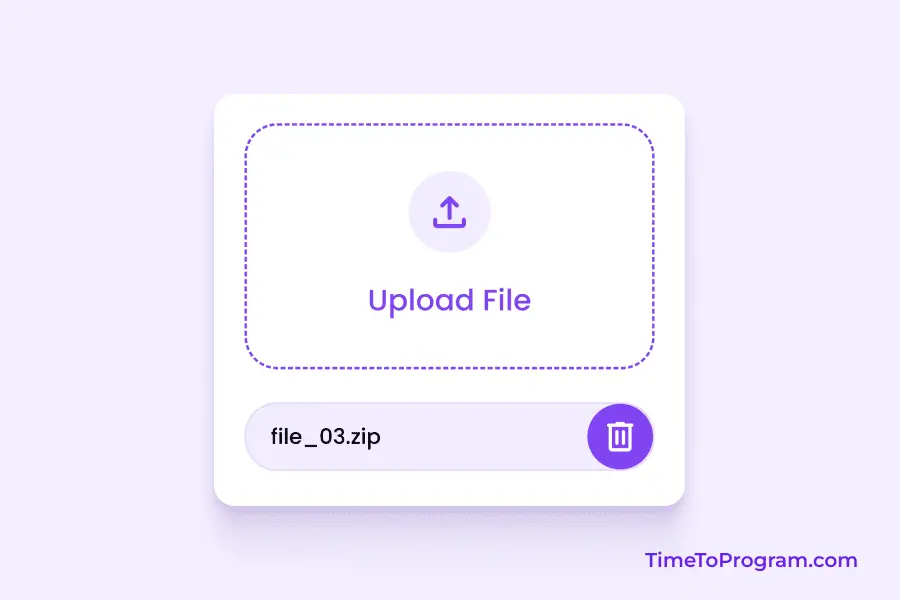
export default AppOutput:
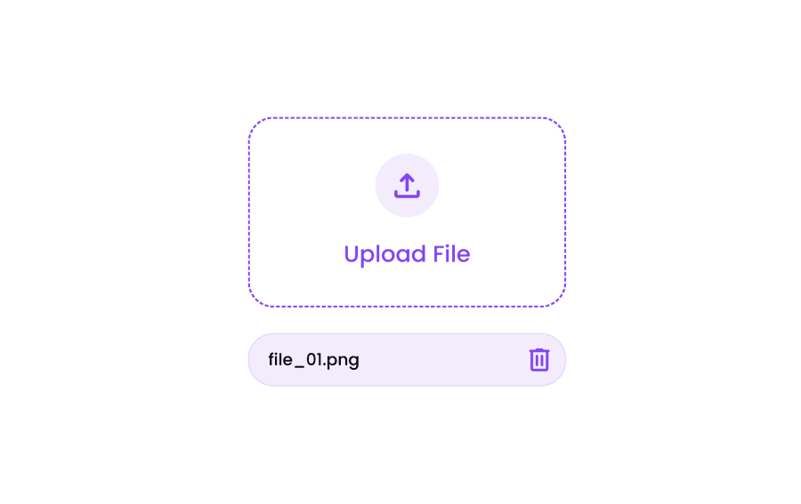
Conclusion
That’s it, we have successfully created a Custom File Input Component in React. This component allows users to choose a file, displays the selected file details, and provides an option to remove the selected file. Hope it was helpful.