In this blog post, we will learn how to upload a file with a progress bar in React JS. Uploading files is a common task in web development, and providing users with a visual indication of the upload progress enhances the user experience.
In this tutorial, we will be handling file selection, displaying file information, and implementing file upload logic with progress tracking.
Step 1: Create the FileUpload Component
Now, let’s create our FileUpload component. Inside the “src/components/FileUpload” folder, create a new file named FileUpload.jsx. This file will contain our file upload component.
import React, { useRef, useState } from "react";
import "./FileUpload.css";
import axios from "axios";
Here, we import the necessary dependencies React for component creation, useRef for accessing the file input element, useState for managing state, and axios for making HTTP requests.
Step 2: Create the File Input and Trigger Button
In this step, we add the JSX code for the file input element and a button that will trigger the file input dialog.
//FileUpload.jsx
import React, { useRef, useState } from "react";
import "./FileUpload.css";
import axios from "axios";
const FileUpload = () => {
const inputRef = useRef();
const [selectedFile, setSelectedFile] = useState(null);
const [progress, setProgress] = useState(0);
const [uploadStatus, setUploadStatus] = useState("select");
const handleFileChange = (event) => {};
const onChooseFile = () => {};
return (
<div>
<input
ref={inputRef}
type="file"
onChange={handleFileChange}
style={{ display: "none" }}
/>
{/* Button to trigger the file input dialog */}
{!selectedFile && (
<button className="file-btn" onClick={onChooseFile}>
<span className="material-symbols-outlined">upload</span> Upload File
</button>
)}
{/* ... */}
</div>
);
};
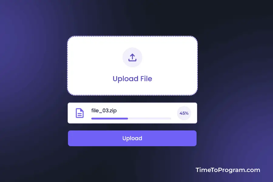
export default FileUpload;In the FileUpload component, we have defined some useState variables to manage file-related data, such as selectedFile to store the currently selected file, progress to represent the upload progress, and uploadStatus to track the status of the upload process (e.g., “select,” “uploading,” or “done”).
Within the component structure, an input element of type “file” is created but hidden (style={{ display: “none” }}). This input element is referenced by inputRef and serves as the mechanism for file selection.
We have used conditional rendering to display the “Upload File” button only when no file is currently selected (!selectedFile). This button, styled with the “file-btn” class, opens the file input dialog when clicked.
Step 3: Handle File Selection and Display File Information
// FileUpload.jsx
const FileUpload = () => {

  const handleFileChange = (event) => {
    if (event.target.files && event.target.files.length > 0) {
      setSelectedFile(event.target.files[0]);
    }
  };

  const onChooseFile = () => {
    inputRef.current.click();
  };

  return (
    <div>

      {/* ... (file input and trigger button) */}

      {selectedFile && (
        <>
          <div className="file-card">
            <span className="material-symbols-outlined icon">description</span>

            <div className="file-info">
              <div style={{ flex: 1 }}>
                <h6>{selectedFile?.name}</h6>

                <div className="progress-bg">
                  <div className="progress" style={{ width: `${progress}%` }} />
                </div>
              </div>

              {uploadStatus === "select" ? (
                <button onClick={clearFileInput}>
                  <span class="material-symbols-outlined close-icon">
                    close
                  </span>
                </button>
              ) : (
                <div className="check-circle">
                  {uploadStatus === "uploading" ? (
                    `${progress}%`
                  ) : uploadStatus === "done" ? (
                    <span
                      class="material-symbols-outlined"
                      style={{ fontSize: "20px" }}
                    >
                      check
                    </span>
                  ) : null}
                </div>
              )}
            </div>
          </div>
          <button className="upload-btn" onClick={handleUpload}>
            {uploadStatus === "select" ? "Upload" : "Done"}
          </button>
        </>
      )}
    </div>
  );
};

export default FileUpload;
The handleFileChange function is responsible for updating the selectedFile state when a user selects a file through the hidden file input element. Additionally, the onChooseFile function is designed to trigger the file input dialog when the visible “Upload File” button is clicked.
The UI is updated to display file information and a progress bar when a file is selected. The file information is encapsulated within a styled file-card div, including the file name and a progress bar (progress state variable).
Conditional rendering is used to display buttons for clearing the selected file or indicating upload progress/completion.
Step 4: Handle File Upload and Update the Progress
// FileUpload.jsx
const FileUpload = () => {
  // ...

  const clearFileInput = () => {
    inputRef.current.value = "";
    setSelectedFile(null);
    setProgress(0);
    setUploadStatus("select");
  };

  const handleUpload = async () => {
    if (uploadStatus === "done") {
      clearFileInput();
      return;
    }

    try {
      setUploadStatus("uploading");

      const formData = new FormData();
      formData.append("file", selectedFile);

      const response = await axios.post(
        "http://localhost:8000/api/upload",
        formData,
        {
          onUploadProgress: (progressEvent) => {
            const percentCompleted = Math.round(
              (progressEvent.loaded * 100) / progressEvent.total
            );
            setProgress(percentCompleted);
          },
        }
      );

      setUploadStatus("done");
    } catch (error) {
      setUploadStatus("select");
    }
  };

  return <div>{/* JSX Structure */}</div>;
};

export default FileUpload;
The handleUpload function is responsible for initiating the file upload process. If the upload status is already “done,” it calls the clearFileInput function to reset the component state and allow for another file selection.
Inside handleUpload, a try-catch block is used to catch errors during the file upload process. The onUploadProgress callback is utilized to track the upload progress and update the progress bar (progress state variable).
The clearFileInput function resets the file input, clears the selected file, sets the progress to 0, and resets the upload status to “select.”
Complete Code of FileUpload.jsx
import React, { useRef, useState } from "react";
import "./FileUpload.css";
import axios from "axios";

const FileUpload = () => {
  const inputRef = useRef();

  const [selectedFile, setSelectedFile] = useState(null);
  const [progress, setProgress] = useState(0);
  const [uploadStatus, setUploadStatus] = useState("select");

  const handleFileChange = (event) => {
    if (event.target.files && event.target.files.length > 0) {
      setSelectedFile(event.target.files[0]);
    }
  };

  const onChooseFile = () => {
    inputRef.current.click();
  };

  const clearFileInput = () => {
    inputRef.current.value = "";
    setSelectedFile(null);
    setProgress(0);
    setUploadStatus("select");
  };

  const handleUpload = async () => {
    if (uploadStatus === "done") {
      clearFileInput();
      return;
    }

    try {
      setUploadStatus("uploading");

      const formData = new FormData();
      formData.append("file", selectedFile);

      const response = await axios.post(
        "http://localhost:8000/api/upload",
        formData,
        {
          onUploadProgress: (progressEvent) => {
            const percentCompleted = Math.round(
              (progressEvent.loaded * 100) / progressEvent.total
            );
            setProgress(percentCompleted);
          },
        }
      );

      setUploadStatus("done");
    } catch (error) {
      setUploadStatus("select");
    }
  };

  return (
    <div>
      <input
        ref={inputRef}
        type="file"
        onChange={handleFileChange}
        style={{ display: "none" }}
      />

      {/* Button to trigger the file input dialog */}
      {!selectedFile && (
        <button className="file-btn" onClick={onChooseFile}>
          <span className="material-symbols-outlined">upload</span> Upload File
        </button>
      )}

      {selectedFile && (
        <>
          <div className="file-card">
            <span className="material-symbols-outlined icon">description</span>

            <div className="file-info">
              <div style={{ flex: 1 }}>
                <h6>{selectedFile?.name}</h6>

                <div className="progress-bg">
                  <div className="progress" style={{ width: `${progress}%` }} />
                </div>
              </div>

              {uploadStatus === "select" ? (
                <button onClick={clearFileInput}>
                  <span class="material-symbols-outlined close-icon">
                    close
                  </span>
                </button>
              ) : (
                <div className="check-circle">
                  {uploadStatus === "uploading" ? (
                    `${progress}%`
                  ) : uploadStatus === "done" ? (
                    <span
                      class="material-symbols-outlined"
                      style={{ fontSize: "20px" }}
                    >
                      check
                    </span>
                  ) : null}
                </div>
              )}
            </div>
          </div>
          <button className="upload-btn" onClick={handleUpload}>
            {uploadStatus === "select" || uploadStatus === 'uploading' ? "Upload" : "Done"}
          </button>
        </>
      )}
    </div>
  );
};

export default FileUpload;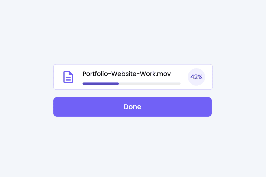
Also check out:
- Create Custom File Input Component in React
- Validate File Size in React
- Create a Custom Tooltip Component in React
Step 5: Styling the FileUpload Component
/* FileUpload.jsx */

.file-btn {
  width: 330px;
  height: 150px;
  font-size: 18px;
  font-weight: 500;
  display: flex;
  flex-direction: column;
  align-items: center;
  justify-content: center;
  gap: 15px;
  color: #5d4dcc;
  background-color: #fff;
  border: 1.5px dashed #5d4dcc;
  border-radius: 20px;
  cursor: pointer;
  transition: all 0.3s ease;
}

.file-btn:hover {
  color: #5d4dcc;
  background-color: #fff;
}

.file-btn span {
  width: 50px;
  height: 50px;
  font-size: 30px;
  color: #5d4dcc;
  display: flex;
  align-items: center;
  justify-content: center;
  border-radius: 25px;
  background-color: #f1efff;
}

.file-card {
  width: 300px;
  display: flex;
  align-items: center;
  gap: 15px;
  color: #000;
  background-color: #fff;
  border: 1px solid rgba(117, 96, 255, 0.281);
  border-radius: 6px;
  padding: 8px 15px;
}

.file-info {
  flex: 1;
  display: flex;
  align-items: center;
  gap: 15px;
}

.file-info h6 {
  flex: 1;
  font-size: 13px;
  font-weight: 400;
}

.progress-bg {
  width: 100%;
  height: 5px;
  background-color: rgba(0, 0, 0, 0.076);
  border-radius: 8px;
  margin-top: 8px;
}

.progress {
  width: 0%;
  height: 5px;
  background-color: #5d4dcc;
  border-radius: 8px;
  transition: width 0.5s ease;
}

.icon {
  font-size: 30px;
  color: #7460ff;
}

.close-icon {
  font-size: 18px;
  cursor: pointer;
}

.file-info button,
.check-circle {
  width: 36px;
  height: 36px;
  display: flex;
  align-items: center;
  justify-content: center;
  font-size: 13px;
  color: #463a99;
  background-color: #f1efff;
  border: none;
  border-radius: 30px;
}

.upload-btn {
  width: 330px;
  font-size: 14px;
  font-weight: 500;
  color: #fff;
  background-color: #7460ff;
  border: none;
  border-radius: 8px;
  padding: 10px;
  margin-top: 15px;
  cursor: pointer;
}
Conclusion
In conclusion, we have built a file upload component with a progress bar in React. We covered setting up the component, handling file selection, displaying file information, and implementing the upload functionality. Hope it was helpful.