In today’s blog post, we will learn how to create a custom tooltip component in React JS. Tooltips are a common UI element that we use to provide additional information when users hover over an element. The tooltip component that we build appears with a transition animation when the user hovers over a designated element.
Creating Custom Tooltip Component
Our Tooltip.jsx component, takes two props infoText for the tooltip content and children for the element to which the tooltip is attached.
// Tooltip.jsx

import React, { useState } from "react";
import "./Tooltip.css";

const Tooltip = ({ infoText, children }) => {
  // State to manage tooltip visibility
  const [showTooltip, setShowTooltip] = useState(false);

  return (
    <div
      className="tooltip-container"
      onMouseEnter={() => setShowTooltip(true)}
      onMouseLeave={() => setShowTooltip(false)}
    >
      {children}

      {/* Tooltip content */}
      <div className={`tooltip ${showTooltip ? "open" : ""}`}>
        {infoText}
        {/* Arrow indicator */}
        <div className="arrow" />
      </div>
    </div>
  );
};

export default Tooltip;
In the above code, we have used the useState hook to manage the visibility of the tooltip. The showTooltip state helps determine whether the tooltip should be displayed.
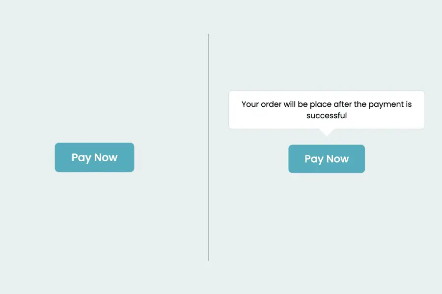
The onMouseEnter and onMouseLeave events trigger the visibility of the tooltip. When a user hovers over the designated element, the tooltip becomes visible, and it disappears when the user moves the cursor away.
return (
    <div
      className="tooltip-container"
      onMouseEnter={() => setShowTooltip(true)}
      onMouseLeave={() => setShowTooltip(false)}
    >
      {children}

      {/* Tooltip content */}
      <div className={`tooltip ${showTooltip ? "open" : ""}`}>
        {infoText}
        {/* Arrow indicator */}
        <div className="arrow" />
      </div>
    </div>
  );
The tooltip JSX structure as a container (tooltip-container) that wraps around the target element (children). The actual tooltip content is contained within a div with the class tooltip. The open class is toggled based on the showTooltip state, enabling a smooth transition effect.
We include an arrow indicator (arrow) within the tooltip. This arrow is positioned to provide a visual cue pointing toward the associated element.
Styling the Tooltip Component
Now Let’s write the styles for the tooltip container, the tooltip itself, and the arrow indicator.
/* Tooltip.css */

.tooltip-container {
  display: flex;
  flex-direction: column;
  gap: 20px;
  align-items: center;
  justify-content: center;
  position: relative;
}

.tooltip {
  width: 280px;
  font-size: 12px;
  font-weight: 400;
  background-color: #fff;
  text-align: center;
  padding: 12px;
  border-radius: 6px;
  border: 1px solid #d8e2e2;
  position: absolute;
  top: -55px;
  transition: all 0.3s ease;
  opacity: 0;
}

.arrow {
  width: 0;
  height: 0;
  border-left: 12px solid transparent;
  border-right: 12px solid transparent;
  border-top: 12px solid #fff;
  position: absolute;
  bottom: -12px;
  left: calc(50% - 12px);
}

.tooltip.open {
 transform: translateY(-30px);
 opacity: 1;
}
The tooltip-container class defines the overall layout, while the tooltip class encapsulates the tooltip’s appearance. Additionally, the arrow class adds a visual indicator pointing toward the associated element. We can adjust these styles as needed to create a tooltip that seamlessly integrates into our application.
Also, check out:
Integrating the Tooltip in App.jsx
Now that we have our custom tooltip component ready, let’s integrate it into our App.jsx.
// App.jsx
import React from "react";
import "./App.css";
import Tooltip from "./components/Tooltip/Tooltip";
const App = () => {
return (
<div className="container">
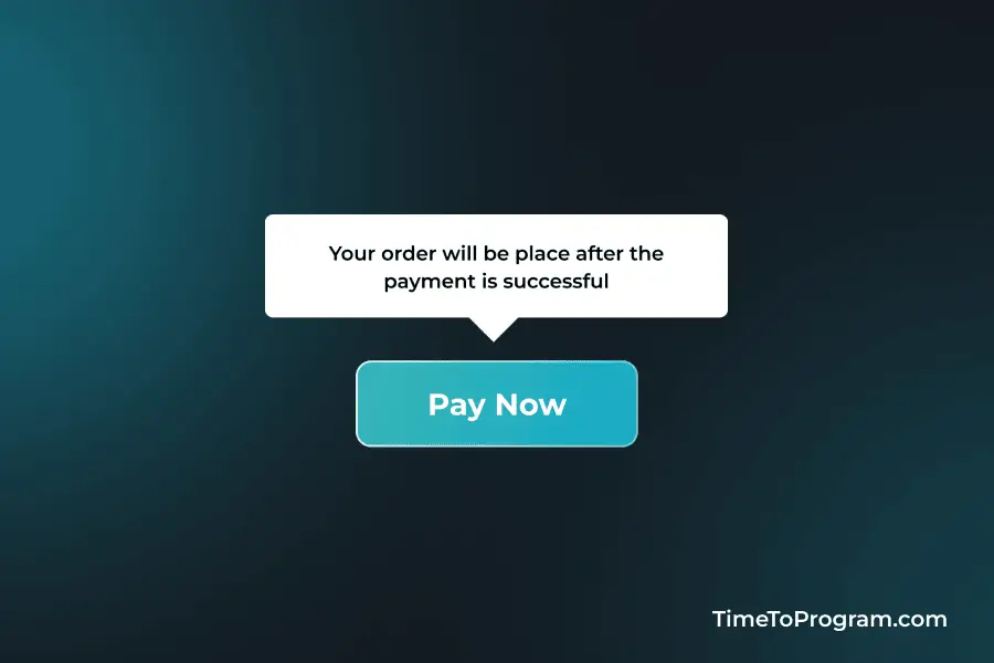
<Tooltip infoText="Your order will be place after the payment is successful">
<button className="btn">Pay Now</button>
</Tooltip>
</div>
);
};
export default App;In the above code, we’ve wrapped a button element with the Tooltip component. The infoText prop is provided to specify the content of the tooltip. In this case, it informs the user that their order will be placed after a successful payment.
Conclusion
In this tutorial, we’ve successfully created a custom tooltip component in React JS. Hope it was helpful.