Today in this blog post, we will create a simple increment decrement counter button in React JS. These buttons are commonly used in e-commerce applications for quantity selection, form input validation, or any scenario requiring a numerical input within a specific range.
Creating the `IncrementDecrementBtn` Component
First, we will create a file named IncrementDecrementBtn.jsx in our React project’s `src/components` folder. And start writing the code:
// IncrementDecrementBtn.jsx

import React, { useState } from "react";
import "./IncrementDecrementBtn.css";

const IncrementDecrementBtn = ({ minValue = 0, maxValue = 100 }) => {
  const [count, setCount] = useState(minValue);

  const handleIncrementCounter = () => {
    if (count < maxValue) {
      setCount((prevState) => prevState + 1);
    }
  };

  const handleDecrementCounter = () => {
    if (count > minValue) {
      setCount((prevState) => prevState - 1);
    }
  };

  return (
    <div className="btn-group">
      <button className="increment-btn" onClick={handleIncrementCounter}>
        <span class="material-symbols-outlined">add</span>
      </button>
      <p>{count}</p>
      <button className="decrement-btn" onClick={handleDecrementCounter}>
        <span class="material-symbols-outlined">remove</span>
      </button>
    </div>
  );
};

export default IncrementDecrementBtn;
In the above code, we have defined the IncrementDecrementBtn functional component, which takes two optional props minValue and maxValue. These props will help us set the boundaries for our counter.
Then, we use the useState hook to create a count state variable initialized with the provided minValue or the default value of 0. We also have two functions, handleIncrementCounter and handleDecrementCounter, which will be triggered when the respective buttons are clicked. Before updating the state, these functions check whether the counter is within the specified boundaries.
JSX Structure
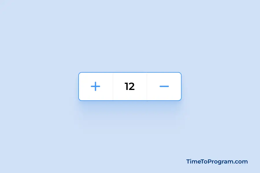
The return statement within the component defines the JSX structure. We used a div with the class btn-group to encapsulate our buttons and counter display.
return (
    <div className="btn-group">
      <button className="increment-btn" onClick={handleIncrementCounter}>
        <span class="material-symbols-outlined">add</span>
      </button>
      <p>{count}</p>
      <button className="decrement-btn" onClick={handleDecrementCounter}>
        <span class="material-symbols-outlined">remove</span>
      </button>
    </div>
  );
The structure consists of two buttons for incrementing and decrementing, each triggering its respective handler function on click. The counter value is displayed between the buttons.
Styling the `IncrementDecrementBtn` Component
/* IncrementDecrementBtn.css */

.btn-group {
  display: flex;
  align-items: center;
  background-color: #fff;
  border-radius: 8px;
  overflow: hidden;
  border: 1px solid #F5F8FB;
  transition: border 0.3s ease;
}

.btn-group:hover {
    border: 1px solid #4097fe
}

button {
  width: 50px;
  height: 50px;
  display: flex;
  align-items: center;
  justify-content: center;
  color: #4097fe;
  background-color: #fff;
  border: none;
  cursor: pointer;
  transition: all 0.3s ease;
}

button:hover {
    background-color: #f3f9ff;
}

p {
  width: 50px;
  display: flex;
  align-items: center;
  justify-content: center;
  border-left: 1px solid #F5F8FB;
  border-right: 1px solid #F5F8FB;
}
This CSS file styles the counter button and provides a smooth transition effect on hover.
Also, check out:
Integrating the Component
Now, import and use the IncrementDecrementBtn component in our `src/App.jsx` component.
// App.jsx
import "./App.css";
import IncrementDecrementBtn from "./components/IncrementDecrementBtn";
function App() {
return (
<div className="container">
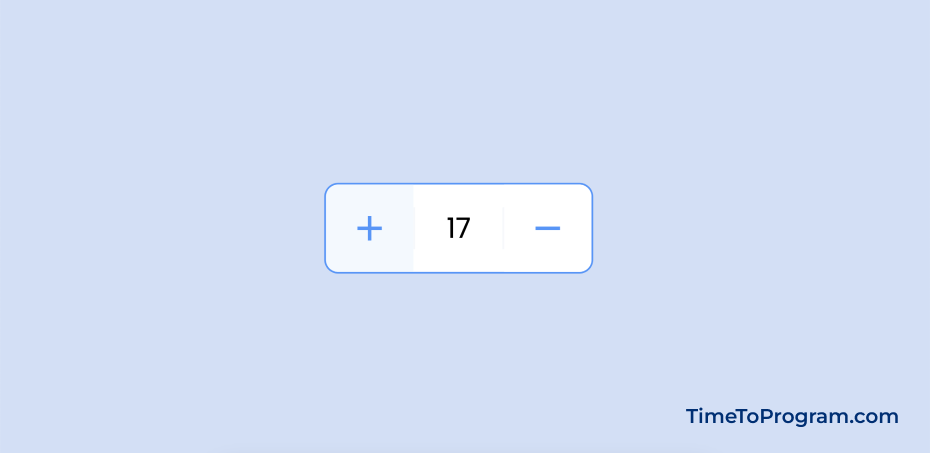
<IncrementDecrementBtn minValue={10} maxValue={25} />
</div>
);
}
export default App;Here, we’ve added the <IncrementDecrementBtn /> component within the return statement of the App component. we can pass any values for minValue and maxValue as props. In this case, we’ve set a minimum value of 10 and a maximum value of 25.
Conclusion
We have successfully implemented the increment decrement counter button in React JS. Hope it was helpful.