In this blog post, we will learn how to create a custom accordion in React JS. Accordions offer a user-friendly way to organize and present information, enhancing the user experience. Let’s start implementing the accordion component.
Step 1: Creating the Custom Accordion Component
Let’s start by creating the CustomAccordion.jsx component. This component will handle the accordion functionality.
// CustomAccordion.jsx

import React, { useState } from "react";
import "./CustomAccordion.css";

const CustomAccordion = ({ title, children }) => {
  const [isOpen, setIsOpen] = useState(false);

  const toggleAccordion = () => {
    setIsOpen(!isOpen);
  };

  return (
    <div className={`accordion ${isOpen ? "active" : ""}`}>
      <div className={`accordion-header ${isOpen ? "active" : ""}`} onClick={toggleAccordion}>
        <p>{title}</p>

        <span class={`material-symbols-outlined ${isOpen ? "active" : ""}`}>
          expand_more
        </span>
      </div>

      {isOpen && (
        <div className="accordion-content">
          <p>{children}</p>
        </div>
      )}
    </div>
  );
};

export default CustomAccordion;
The CustomAccordion.jsx component takes title and children as props, representing the title and content of the accordion, respectively. The toggleAccordion function toggles the isOpen state when the accordion header is clicked.
The component dynamically adjusts its appearance based on the isOpen state variable. The header displays the title and an expand/collapse icon, and the content is rendered only when the accordion is open.
Step 2: Styling the `CustomAccordion.jsx` Component
/* CustomAccordion.css */

.accordion {
  width: 600px;
  border: 1px solid #43434a;
  margin-bottom: 20px;
  border-radius: 8px;
  overflow: hidden;
  transition: all 0.3s ease;
}

.accordion:hover {
  transform: scale(1.02);
}

.accordion.active {
  transform: scale(1.03);
  border: 1px solid #6ae88b;
}

.accordion-header {
  display: flex;
  align-items: center;
  justify-content: space-between;
  background-color: #17161a;
  padding: 15px 20px;
  cursor: pointer;
}

.accordion-header p {
  color: #fff;
}

.accordion-header span {
  width: 38px;
  height: 38px;
  font-size: 24px;
  display: flex;
  align-items: center;
  justify-content: center;
  color: #6ae88b;
  background: #44484d;
  border-radius: 50%;
  user-select: none;
  transition: all 0.3s ease;
}

.accordion-header span.active {
  transform: rotate(180deg);
}

.accordion-content {
  font-size: 14px;
  text-align: justify;
  line-height: 26px;
  padding: 20px;
  color: #95959a;
  background-color: #17161a;
  border-top: 1px solid #43434a;
}
This CSS code styles the CustomAccordion component. It sets the accordion’s dimensions, border, and hover effects.
Step 3: Integrate Our Custom Accordion Component into the App.jsx
First, we will create an object in the array that represents an accordion item and has properties like id, title, and description.
export const DATA_LIST = [
  {
    id: "01",
    title: "Accordion Item 01",
    description: `Accordion O1 description`,
  },
  {
    id: "02",
    title: "Accordion Item 02",
    description: `Accordion O2 description`,
  },
  // ...
]
Now, within the App.jsx file, we’ll map over the DATA_LIST array to dynamically generate CustomAccordion components for each item. We’ll pass the title and description as props to effectively display the content within the accordions.
// App.jsx

import React from "react";
import "./App.css";
import CustomAccordion from "./components/CustomAccordion";
import { DATA_LIST } from "./utils/data";

const App = () => {
  return (
    <div className="container">
      {DATA_LIST.map((item) => (
        <CustomAccordion title={item.title} key={item.id}>
          <p>{item.description}</p>
        </CustomAccordion>
      ))}
    </div>
  );
};

export default App;
In the above code, we have imported the DATA_LIST data from the file located at “./utils/data”. In the JSX code, we have mapped over the DATA_LIST array and created a CustomAccordion component for each item.
The CustomAccordion component is provided with two props:
- title: The
titleproperty of each item inDATA_LIST. - key: The
idproperty of each item inDATA_LIST. Adding key prop is necessary for React to efficiently update the UI.
Within each CustomAccordion, there is a <p> element containing the description property of each item in DATA_LIST.
Also, check out:
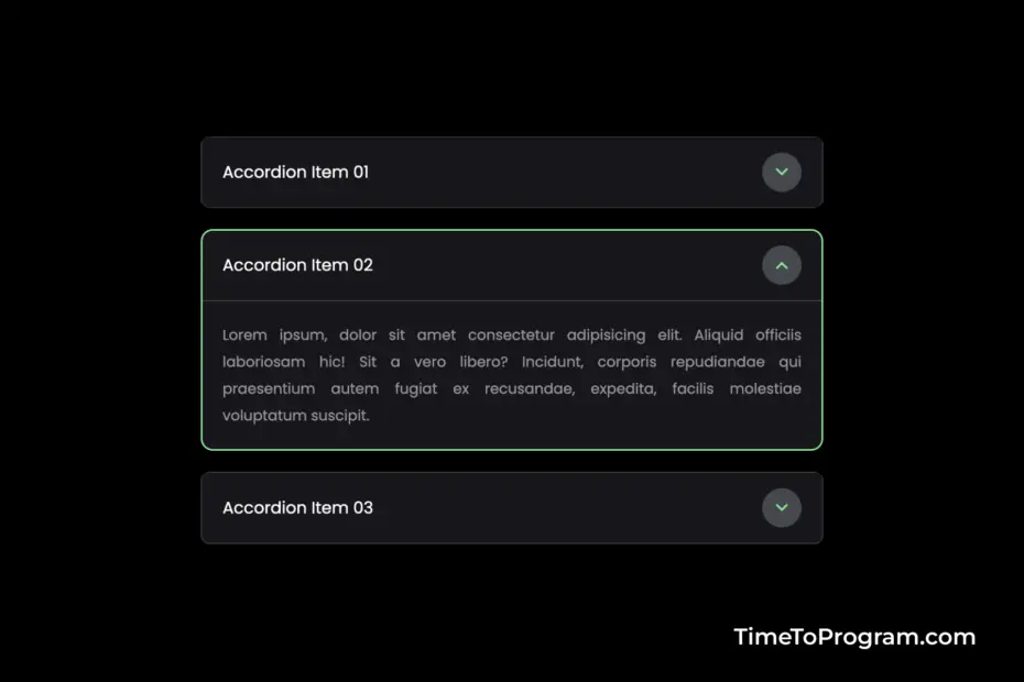
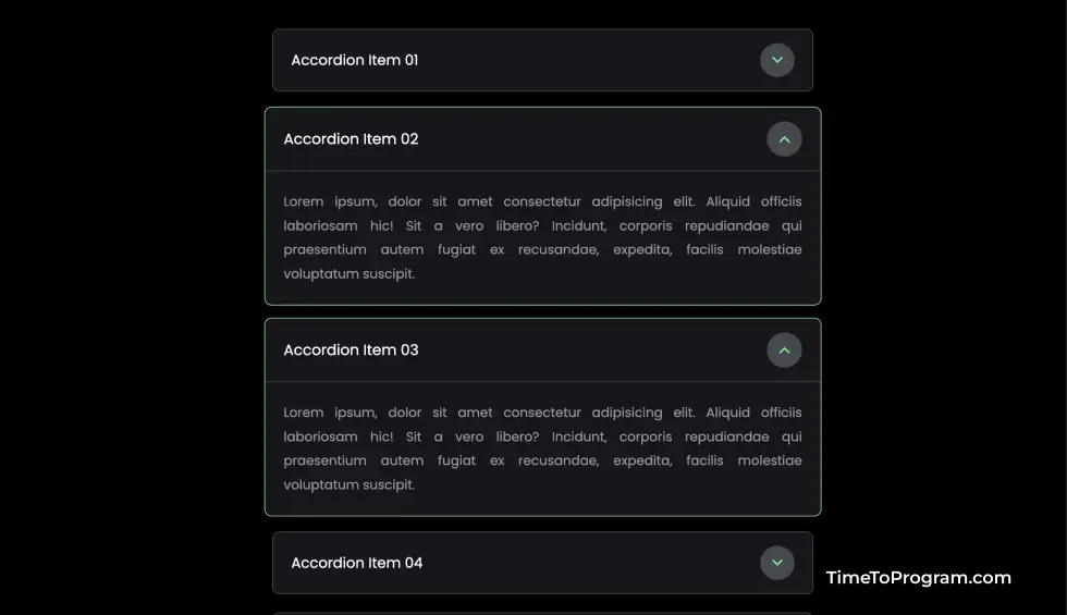
Output:
Conclusion
That’s it, we have successfully created a custom accordion component in React JS. Hope it was helpful.