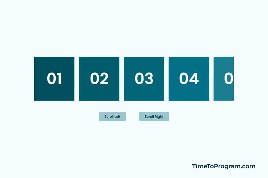
In this tutorial, we will learn how to create a horizontal scrolling component with buttons in React. This can be useful when we want to elegantly showcase content that extends beyond the screen’s boundaries, such as image carousels, timelines, data grids, etc.
Horizontal Scrolling Component with Buttons in React
Creating the Sample Data
Our horizontal scrolling component will display a set of cards with unique IDs and background colors. To achieve this, we’ll create a sample data array.
export const SAMPLE_DATA = [
  { id: "01", color: "#014f5e" },
  { id: "02", color: "#015a6b" },
  { id: "03", color: "#016679" },
  { id: "04", color: "#017186" },
  { id: "05", color: "#1a7f92" },
  { id: "06", color: "#348d9e" },
  { id: "07", color: "#4d9caa" },
  { id: "08", color: "#67aab6" },
  { id: "09", color: "#80b8c3" },
];
Building the Component Structure
Now, let’s start building the React component that will handle horizontal scrolling. Here’s the code structure:
import React, { useRef, useState } from "react";
import "./App.css";
import { SAMPLE_DATA } from "./utils/data";

function App() {
  const [scrollPosition, setScrollPosition] = useState(0);

  const containerRef = useRef();

  // Function to handle scrolling when the button is clicked
  const handleScroll = (scrollAmount) => {
    // ...
  };

  return (
    <div className="container">
      <div
        ref={containerRef}
        style={{
          width: "900px",
          overflowX: "scroll",
          scrollBehavior: "smooth",
        }}
      >
        <div className="content-box">
          {SAMPLE_DATA.map((item) => (
            <div className="card" style={{ backgroundColor: item.color }}>
              <p>{item.id}</p>
            </div>
          ))}
        </div>
      </div>

      <div className="action-btns">
        <button onClick={() => handleScroll(-200)}>Scroll Left</button>
        <button onClick={() => handleScroll(200)}>Scroll Right</button>
      </div>
    </div>
  );
}

export default App;
This code creates the React component structure with a scrolling container and buttons. Our component dynamically displays data from the SAMPLE_DATA array as cards. Each card has a unique ID and background color.
To make our component interactive, we will add two buttons “Scroll Left” and “Scroll Right.” Clicking these buttons triggers the handleScroll function.

Styling the Component
.container {
  width: 100vw;
  height: 100vh;
  display: flex;
  flex-direction: column;
  align-items: center;
  justify-content: center;
  background-color: #eeeeee;
}

.content-box {
  width: 1800px;
  display: flex;
  align-items: center;
  gap: 20px;
}

.card {
  width: 200px;
  height: 200px;
  display: flex;
  align-items: center;
  justify-content: center;
}

.card p {
  font-size: 70px;
  font-weight: 600;
  color: #ffffff;
  opacity: 0.4;
}

.action-btns {
  display: flex;
  align-items: center;
  gap: 60px;
  margin-top: 50px;
}

.action-btns button {
  font-size: 15px;
  font-weight: 500;
  color: #002d36;
  background-color: #99c6cf;
  border-radius: 6px;
  padding: 10px 25px;
  border: none;
  cursor: pointer;
  transition: all 0.5s ease;
}

.action-btns button:hover {
  color: #ffffff;
  background-color: #002d36;
}
Implementing Horizontal Scrolling
One of the key features of our component is the ability to scroll horizontally when the buttons are clicked. Here’s how it’s achieved:
// Function to handle scrolling when the button is clicked
const handleScroll = (scrollAmount) => {
  // Calculate the new scroll position
  const newScrollPosition = scrollPosition + scrollAmount;

  // Update the state with the new scroll position
  setScrollPosition(newScrollPosition);

  // Access the container element and set its scrollLeft property
  containerRef.current.scrollLeft = newScrollPosition;
};
The handleScroll function calculates the new scroll position and updates the state variable. It then adjusts the scrollLeft property of the container to create the scrolling effect.
Also check out:
Conclusion
In this tutorial, we’ve created a horizontal scrolling component with buttons in React. We’ve covered creating sample data, building the component structure, styling the component, implementing horizontal scrolling, and displaying data.
