In this blog post, we will learn how to create a custom reusable modal component in React JS. Modal components are a common UI pattern in web development, providing a way to present information or capture user input in a clean and user-friendly manner.
Step 1: Project Structure
/src
  /components
    /CustomModal
      Modal.jsx
      Modal.css
  App.jsx
  App.css
The /components directory contains reusable components that can be utilized throughout your application. Within the components directory, we create a /CustomModal subdirectory specifically for the custom modal component. This subdirectory contains two files: Modal.jsx for the React component logic and Modal.css for styling.
Step 2: Implementing the Modal Component
Now that we have a clear project structure, let’s dive into the implementation of the custom reusable modal component.
// Modal.jsx

import React from "react";
import "./Modal.css";

const Modal = ({ isOpen, onClose, children }) => {
  const handleClose = () => {
    onClose();
  };

  return (
    <div className={`modal ${isOpen ? "open" : ""}`}>
      <div className="modal-overlay" onClick={handleClose}></div>

      <div className="modal-content">
        <button className="close-button" onClick={handleClose}>
          <span class="material-symbols-outlined">close</span>
        </button>

        {children}
      </div>
    </div>
  );
};

export default Modal;
The Moda component takes three props isOpen, onClose, and children.
isOpen: A boolean that determines whether the modal is visible.onClose: A callback function to handle the close action.children: The content that will be rendered inside the modal component.
The handleClose function is called when the overlay or the close button is clicked, triggering the onClose callback.
The modal class is conditionally applied alongside the open class, depending on the value of the isOpen prop.
Step 3: Styling the Modal
/* Modal.css */

.modal {
  display: none;
  position: fixed;
  top: 0;
  left: 0;
  width: 100%;
  height: 100%;
  background-color: rgba(0, 0, 0, 0.07);
  justify-content: center;
  align-items: center;
}

.modal.open {
  display: flex;
}

.modal-overlay {
  position: absolute;
  top: 0;
  left: 0;
  width: 100%;
  height: 100%;
}

.modal-content {
  min-width: 350px;
  max-width: 400px;
  max-height: 70vh;
  background-color: #fff;
  padding: 20px;
  border-radius: 5px;
  overflow-y: scroll;
  position: relative;
  box-shadow: 0px 37px 80px rgba(24, 52, 47, 0.028);
}

.close-button {
  font-size: 15px;
  color: #092b247a;
  background-color: transparent;
  border: none;
  position: absolute;
  top: 10px;
  right: 10px;
  cursor: pointer;
}
The above CSS code provides styles for the modal, overlay, content, and close button. The modal is initially hidden and becomes visible when the open class is applied.
Step 4: Using the Modal Component in App.jsx
Now that our reusable modal component is ready, let’s integrate it into our App.jsx:
// App.jsx
import React, { useState } from "react";
import "./App.css";
import Modal from "./components/CustomModal/Modal";
const App = () => {
const [isModalOpen, setIsModalOpen] = useState(false);
const openModal = () => {
setIsModalOpen(true);
};
const closeModal = () => {
setIsModalOpen(false);
};
return (
<div className="container">
<button className="btn" onClick={openModal}>
Open Modal
</button>
<Modal isOpen={isModalOpen} onClose={closeModal}>
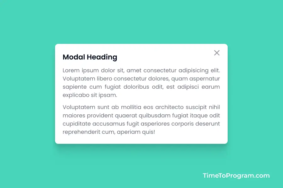
<h2>This is a Modal</h2>
<p>
This is a simple modal description text.
</p>
</Modal>
</div>
);
};
export default App;In the above code, The isModalOpen state determines whether the modal is currently open or closed. The openModal function sets isModalOpen to true, triggering the modal’s appearance. And the closeModal function sets isModalOpen to false, hiding the modal.
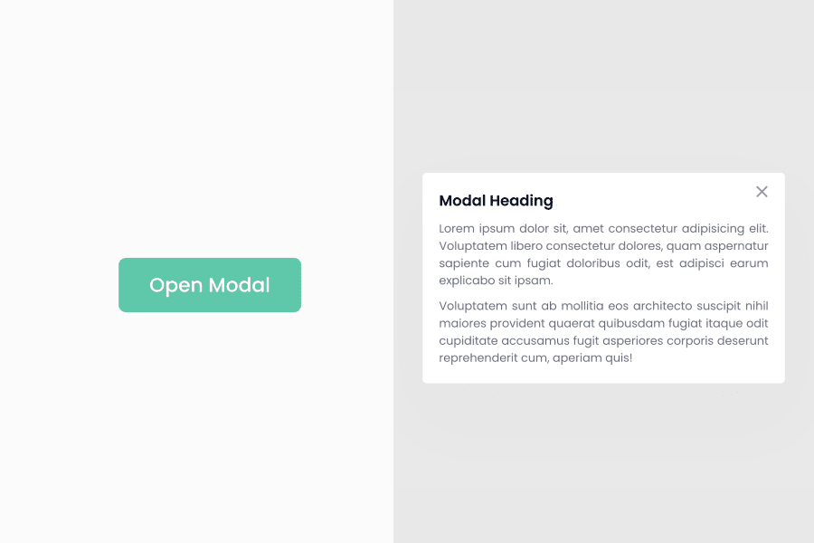
We are passing the isOpen and onClose props to our Modal component. The isOpen prop is dynamically assigned the value of isModalOpen, allowing the modal to appear or disappear based on the state. Secondly, the onClose prop is provided with the closeModal function, enabling the modal to respond to the close action.
Also, check out:
Conclusion
That’s it, we have successfully created a custom reusable modal component in React JS. Hope it was helpful.