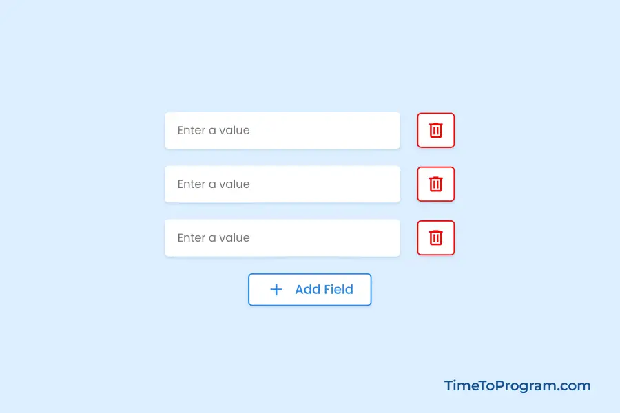
In this blog post, we will learn how to create a dynamic input field using React JS. We will implement functionality such as adding a new input field, deleting an existing input field, and handling the input field value change when a user types something.
Creating Dynamic Input Fields in React JS
Step 1: Defining State Variable to Manage Input Fields
In the App.js file, we will define a state variable for the input fields:
import React, { useState } from "react";
import "./App.css";

const App = () => {
  const [inputFields, setInputFields] = useState([{ value: "" }]);

  return <div>{/* JSX Code Here */}</div>;
};

export default App;
This state variable inputFields will keep track of the dynamic input fields. The setInputFields function will be used to update this state.
Step 2: Creating the Input Fields
Now, let’s render the input fields based on the inputFields state, inside the return section of our App component.
import React, { useState } from "react";
import "./App.css";
const App = () => {
const [inputFields, setInputFields] = useState([{ value: "" }]);
// Function to add a new input field
const handleAddFields = () => {};
// Function to remove an input field by index
const handleRemoveFields = (index) => {};
// Function to update the value of an input field
const handleValueChange = (index, event) => {};
return (
<div className="container">
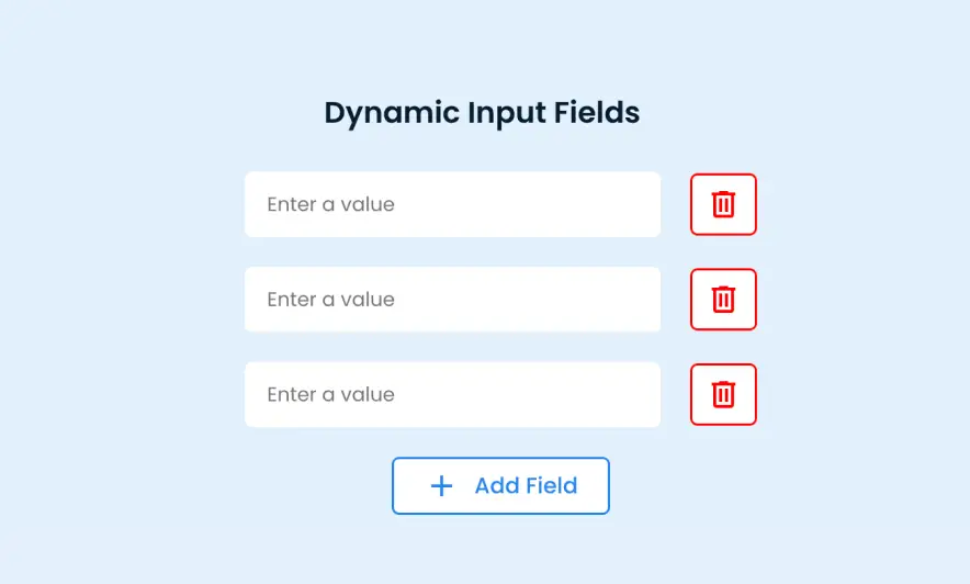
<h2>Dynamic Input Fields</h2>
{inputFields.map((inputField, index) => (
<div className="input-container" key={index}>
<input
type="text"
placeholder="Enter a value"
value={inputField.value}
onChange={(e) => handleValueChange(index, e)}
/>
<button
className="delete-btn"
onClick={() => handleRemoveFields(index)}
>
<span class="material-symbols-outlined delete-icon">delete</span>
</button>
</div>
))}
<button className="add-btn" onClick={handleAddFields}>
<span class="material-symbols-outlined add-icon">add</span>Add Field
</button>
</div>
);
};
export default App;Within the component’s render method, we have the code responsible for rendering the dynamic input fields. This code iterates through the inputFields array, generating input fields and their corresponding delete buttons for each element.
Each input field includes an onChange event handler, enabling real-time updates to the field’s value as users type.
The delete button’s onClick event handler is linked to the handleRemoveFields function, allowing users to remove specific input fields as needed. Additionally, there’s an “Add Field” button at the end. When clicked, it invokes the handleAddFields function, enabling users to add new input fields dynamically.
Step 3: Handle Input Value Change
// Function to update the value of an input field
const handleValueChange = (index, event) => {
  const values = [...inputFields];
  values[index].value = event.target.value;
  setInputFields(values);
};Ï
This function updates the value of an input field when the user types something. It clones the inputFields array, updates the value of the specified input field, and sets the new array in the state.
Step 4: Adding Input Fields Dynamically
Let’s implement the handleAddFields function to enable the addition of new input fields in a dynamic manner.
// Function to add a new input field
const handleAddFields = () => {
  setInputFields([...inputFields, { value: "" }]);
};
Inside the function, setInputFields is used to update the state of inputFields. We use the spread operator ([...inputFields]) to create a copy of the existing array of input fields. A new object { value: "" } is appended to this array, representing an additional input field. The value property is initialized as an empty string, indicating that the new input field starts with no text.
Step 5: Removing Input Fields
// Function to remove an input field by index
const handleRemoveFields = (index) => {
  const newInputFields = [...inputFields];
  newInputFields.splice(index, 1);
  setInputFields(newInputFields);
};Ï
Inside the handleRemoveFields function, we first create a new array, newInputFields, by using the spread operator to make a copy of the existing inputFields array.
Within the copied array, the splice method is used to remove one element at the specified index. This index corresponds to the input field the user intends to delete.
Finally, the state is updated with the modified newInputFields array. This triggers a re-render of the component, reflecting the removal of the selected input field.
Also, check out:
Complete Code
App.jsx

import React, { useState } from "react";
import "./App.css";

const App = () => {
  const [inputFields, setInputFields] = useState([{ value: "" }]);

  // Function to add a new input field
  const handleAddFields = () => {
    setInputFields([...inputFields, { value: "" }]);
  };

  // Function to remove an input field by index
  const handleRemoveFields = (index) => {
    const newInputFields = [...inputFields];
    newInputFields.splice(index, 1);
    setInputFields(newInputFields);
  };

  // Function to update the value of an input field
  const handleValueChange = (index, event) => {
    const values = [...inputFields];
    values[index].value = event.target.value;
    setInputFields(values);
  };

  return (
    <div className="container">
      <h2>Dynamic Input Fields</h2>

      {inputFields.map((inputField, index) => (
        <div className="input-container" key={index}>
          <input
            type="text"
            placeholder="Enter a value"
            value={inputField.value}
            onChange={(e) => handleValueChange(index, e)}
          />

          <button className="delete-btn" onClick={() => handleRemoveFields(index)}>
            <span class="material-symbols-outlined delete-icon">delete</span>
          </button>
        </div>
      ))}

      <button className="add-btn" onClick={handleAddFields}>
        <span class="material-symbols-outlined add-icon">add</span>Add Field
      </button>
    </div>
  );
};

export default App;
App.css
h2 {
font-size: 20px;
font-weight: 600;
color: #071b30;
margin: 0 25px 5px 0;
}
.input-container {
display: flex;
align-items: center;
gap: 20px;
margin-top: 20px;
}
input[type="text"] {
width: 250px;
border: none;
padding: 12px 15px;
border-radius: 5px;
}
input:focus {
outline: 1.5px solid #2485EE;
}
.delete-btn {
width: 45px;
height: 42px;
display: flex;
align-items: center;
justify-content: center;
color: #ff0000;
background-color: #ffffff;
border: 1.5px solid #ff0000;
border-radius: 5px;
transition: all 0.4s ease;
cursor: pointer;
}
.delete-btn:hover {
color: #ffffff;
background-color: #ff0000;
}
.add-btn {
display: flex;
align-items: center;
gap: 10px;
font-size: 15px;
font-weight: 500;
color: #2485EE;
background-color: #ffffff;
border: 1.5px solid #2485EE;
border-radius: 5px;
padding: 6px 20px;
margin-top: 20px;
transition: all 0.4s ease;
cursor: pointer;
}
.add-btn:hover {
color: #ffffff;
background-color: #2485EE;
}Conclusion
In this tutorial, we learned how to create dynamic input fields in React. We utilized React useState to manage the input fields and provided functions to add, remove, and update these fields.