Hello guys, today I’m going to create a simple NavBar using HTML and CSS. I have also added some nice little hover effects to menu items. let’s get started.
Video Tutorial | Navigation Bar in HTML CSS
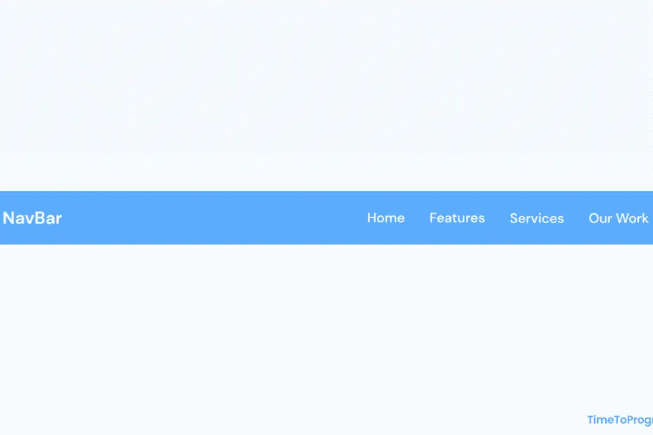
As you can see in the video tutorial when I hover over the navigation link, we have the underline animation going. I have created that underline using the after pseudo-element on the li tag and animated the width property on hover.
HTML Code
<!DOCTYPE html>
<html lang="en">
<head>
    <meta charset="UTF-8">
    <meta http-equiv="X-UA-Compatible" content="IE=edge">
    <meta name="viewport" content="width=device-width, initial-scale=1.0">
    <title>NavBar</title>
    <link rel="stylesheet" href="./style.css">
</head>
<body>
    <header>
        <div class="brand"><a href="#">NavBar</a></div>

        <nav>
            <ul>
                <li><a href="#">Home</a></li>
                <li><a href="#">Features</a></li>
                <li><a href="#">Services</a></li>
                <li><a href="#">Our Works</a></li>
            </ul>
        </nav>
    </header>
</body>
</html>
In the above HTML code, we have a header tag containing the brand name or website name, and navbar links.
CSS
@import url('https://fonts.googleapis.com/css2?family=Montserrat:wght@400;500;600;700&display=swap');

html, body {
    font-family: "Montserrat", sans-serif;
    background-color: aliceblue;
}

* {
    padding: 0;
    margin: 0;
    box-sizing: border-box;
}

header {
    display: flex;
    align-items: center;
    justify-content: space-between;
    padding: 1.1rem 5rem;
    background: linear-gradient(180deg, #6fb4fd 0%, #5caafc 100%);
}

.brand a {
    text-decoration: none;
    font-size: 1.2rem;
    font-weight: 600;
    color: #fff;
}

ul {
    display: flex;
    flex-direction: row;
}

li {
    list-style-type: none;
    margin-left: 3rem;
}

li > a{
    text-decoration: none;
    color: #fff;
    font-size: 0.9rem;
    font-weight: 500;
}


li::after {
    content: '';
    width: 0rem;
    height: 0.15rem;
    background-color: #fff;
    display: block;
    border-radius: 0.2rem;
    margin: 0.2rem auto 0 auto;
    transition: all 0.3s ease-in-out;
}

li:hover::after {
    width: 2rem;
}
Also check out:
Firstly we started styling our header by placing the brand name or website name on the top left side and the nav menu on the top right side using the flexbox property justify-content: space-between. We also used flexbox to display the nav menu horizontally.
For hover animation on navigation links, I have used after pseudo-element on li tag to create the underline. For animating it I have just played with the width property on hover as you can see in the above CSS code.
Hope you like it.