Today in this article, we are going to create a navbar profile dropdown menu using HTML and CSS.
Video Tutorial | Navbar Dropdown Menu
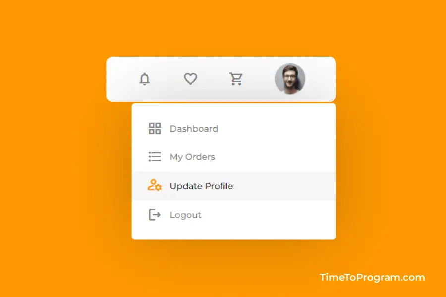
As you can see in the above video, we have a simple navbar menu with only icons and a profile file image. When I hover over the profile image, a dropdown menu will appear, containing four menu items Dashboard, My Orders, Update Profile, and Logout.
index.html
<!DOCTYPE html>
<html lang="en">
  <head>
    <meta charset="UTF-8" />
    <meta http-equiv="X-UA-Compatible" content="IE=edge" />
    <meta name="viewport" content="width=device-width, initial-scale=1.0" />
    <link rel="preconnect" href="https://fonts.googleapis.com" />
    <link rel="preconnect" href="https://fonts.gstatic.com" crossorigin />
    <link
      href="https://fonts.googleapis.com/css2?family=Montserrat:wght@400;500;700&display=swap"
      rel="stylesheet"
    />
    <link
      href="https://fonts.googleapis.com/icon?family=Material+Icons+Outlined"
      rel="stylesheet"
    />
    <link rel="stylesheet" href="styles.css" />
    <title>Document</title>
  </head>
  <body>
    <nav>
      <ul>
        <li>
          <span class="material-icons-outlined"> notifications </span>
        </li>
        <li>
          <span class="material-icons-outlined"> favorite_border </span>
        </li>
        <li>
          <span class="material-icons-outlined"> shopping_cart </span>
        </li>
        <li>
          <img src="images/profile.png" class="profile" />
          <ul>
            <li class="sub-item">
              <span class="material-icons-outlined"> grid_view </span>
              <p>Dashboard</p>
            </li>
            <li class="sub-item">
              <span class="material-icons-outlined">
                format_list_bulleted
              </span>
              <p>My Orders</p>
            </li>
            <li class="sub-item">
              <span class="material-icons-outlined"> manage_accounts </span>
              <p>Update Profile</p>
            </li>
            <li class="sub-item">
              <span class="material-icons-outlined"> logout </span>
              <p>Logout</p>
            </li>
          </ul>
        </li>
      </ul>
    </nav>
  </body>
</html>
In index.html, we have our menu items inside the <nav> element. For icons, we are using material icons. To show the dropdown menu when we hover on the profile image, we will place the dropdown menu inside the profile image <li> tag.
Also check out:
- How to Create NavBar Using HTML and CSS
- Create Automatic Image Slider in HTML CSS
- Create Multi-Level Dropdown Using HTML CSS
styles.css
html {
  box-sizing: border-box;
}

body {
  margin: 0;
  padding: 20% 0;
  overflow-x: hidden;
  font-family: "Montserrat", sans-serif;
  min-height: 100vh;
  display: flex;
  justify-content: center;
  align-items: flex-start;
  background-color: #ff9800;
}

* {
  box-sizing: inherit;
}

img {
  max-width: 100%;
  height: auto;
}

nav {
  background-color: #fff;
  padding: 0 3rem;
  border-radius: 0.625rem;
}

ul {
  margin: 0;
  padding: 0;
  display: flex;
  align-items: center;
  gap: 3rem;
}

li {
  list-style-type: none;
  position: relative;
  padding: 0.625rem 0 0.5rem;
}
li ul {
  flex-direction: column;
  position: absolute;
  background-color: white;
  align-items: flex-start;
  transition: all 0.5s ease;
  width: 20rem;
  right: -3rem;
  top: 4.5rem;
  border-radius: 0.325rem;
  gap: 0;
  padding: 1rem 0rem;
  opacity: 0;
  box-shadow: 0px 0px 100px rgba(20, 18, 18, 0.25);
  display: none;
}

ul li:hover > ul,
ul li ul:hover {
  visibility: visible;
  opacity: 1;
  display: flex;
}

.material-icons-outlined {
  color: #888888;
  transition: all 0.3s ease-out;
}

.material-icons-outlined:hover {
  color: #ff9800;
  transform: scale(1.25) translateY(-4px);
  cursor: pointer;
}


.profile {
  height: 3rem;
  width: auto;
  cursor: pointer;
}

.sub-item {
  width: 100%;
  display: flex;
  align-items: center;
  gap: 0.725rem;
  cursor: pointer;
  padding: 0.5rem 1.5rem;
}

.sub-item:hover {
  background-color: rgba(232, 232, 232, 0.4);
}

.sub-item:hover .material-icons-outlined {
  color: #ff9800;
  transform: scale(1.08) translateY(-2px);
  cursor: pointer;
}

.sub-item:hover p {
  color: #000;
  cursor: pointer;
}

.sub-item p {
  font-size: 0.85rem;
  color: #888888;
  font-weight: 500;
  margin: 0.4rem 0;
  flex: 1;
}
I have written some styles to ul and li tags to display <li> elements in a row. To do that I have used flexbox. Also added scale and translateY hover effects to menu items.
The opacity for the dropdown menu will be set to 0 and the display property will be set to none. When the user hovers over the profile image, the dropdown menu opacity will be set to 1 and display property to flex.
Output