In this tutorial, we will learn how to create a multi-level dropdown menu using HTML, CSS, and JavaScript. Dropdown menus are a common element in web design, and they can be enhanced with multi-level functionality to organize and display information more efficiently.
A multi-level dropdown menu is a user interface component that allows us to display nested items within a dropdown. It’s a great way to present complex navigation structures or organize content hierarchically. In this blog post, we’ll create a simple yet functional multi-level dropdown menu from scratch.
Create Multi-Level Dropdown Using HTML CSS and Javascript
In this tutorial, we’ll cover:
- HTML Structure: We’ll start by creating the basic HTML structure for our dropdown menu, including the button trigger and the dropdown content.
- CSS Styling: We’ll apply CSS styles to make our dropdown menu visually appealing and responsive.
- JavaScript Functionality: We’ll add JavaScript code to toggle the visibility of the dropdown and allow users to close it by clicking outside.
Now, let’s dive into the step-by-step implementation.
Step 1: HTML Structure
We’ll begin by setting up the HTML structure. We have a div element with the class dropdown that contains a button with the class dropdown-btn and a nested div with the class “dropdown-content” for the menu items.
<!DOCTYPE html>
<html lang="en">
  <head>
    <meta charset="UTF-8" />
    <meta name="viewport" content="width=device-width, initial-scale=1.0" />

    <link rel="preconnect" href="https://fonts.googleapis.com" />
    <link rel="preconnect" href="https://fonts.gstatic.com" crossorigin />
    <link
      href="https://fonts.googleapis.com/css2?family=Poppins:wght@300;400;500;600;700&display=swap"
      rel="stylesheet"
    />

    <link
      rel="stylesheet"
      href="https://fonts.googleapis.com/css2?family=Material+Symbols+Outlined:opsz,wght,FILL,GRAD@20..48,100..700,0..1,-50..200"
    />

    <link rel="stylesheet" href="styles.css" />
    <title>Dropdown Button</title>
  </head>

  <body>
    <div class="dropdown">
      <button class="dropdown-btn" onclick="toggleDropdown()">
        Dashboard
        <span class="material-symbols-outlined expand-icon"> expand_more </span>
      </button>

      <div class="dropdown-content" id="myDropdown">
        <a href="#">
          <span class="material-symbols-outlined"> cottage </span>
          Home
        </a>
        <a href="#">
          <span class="material-symbols-outlined">category</span>
          Products
        </a>
        <a href="#">
          <span class="material-symbols-outlined">donut_large</span>
          Services
        </a>

        <div class="nested-dropdown">
          <a href="#">
            <span class="material-symbols-outlined">contact_support</span>
            Contact Us
          </a>

          <div class="nested-dropdown-content">
            <a href="#">
              <span class="material-symbols-outlined">contact_mail</span>
              Contact Information
            </a>
            <a href="#">
              <span class="material-symbols-outlined">unknown_document</span>
              Inquiry Form
            </a>
            <a href="#">
              <span class="material-symbols-outlined">explore</span>
              Visit Us
            </a>
          </div>
        </div>

        <a href="#">
          <span class="material-symbols-outlined">info</span>
          About Us
        </a>
      </div>
    </div>

    <script src="./script.js"></script>
  </body>
</html>
The onclick attribute in the button element is set to call the toggleDropdown() JavaScript function when clicked.
Step 2: CSS Styling
Next, let’s apply CSS styles to make our dropdown visually appealing. Here’s the CSS code:
* {
  margin: 0px;
  padding: 0px;
  font-family: "Poppins", sans-serif;
}

body {
  height: 70vh;
  display: flex;
  align-items: center;
  justify-content: center;
  background: linear-gradient(107deg, #E5F0FD 0.23%, #D1E6FF 100%);
}

.dropdown {
  position: relative;
  display: inline-block;
}

.dropdown-btn {
  display: flex;
  align-items: center;
  gap: 10px;
  font-size: 17px;
  color: #4d4d4d;
  border: none;
  padding: 14px 40px;
  border-radius: 10px;
  background-color: #ffffff;
  cursor: pointer;
}

.dropdown-content {
  display: none;
  position: absolute;
  background-color: #ffffff;
  min-width: 210px;
  z-index: 1;
  margin-top: 20px;
  border-radius: 10px;
}

.show-dropdown {
  display: block;
}

/* Styles for nested dropdowns */
.nested-dropdown {
  position: relative;
}

.nested-dropdown-content {
  display: none;
  position: absolute;
  left: 100%;
  top: 0;
  background-color: #ffffff;
  min-width: 250px;
  z-index: 1;
  border-radius: 0 10px 10px 10px;
}

.nested-dropdown:hover .nested-dropdown-content {
  display: block;
}

.dropdown-content a,
.nested-dropdown-content a {
  color: #70747c;
  padding: 15px 16px;
  text-decoration: none;
  display: flex;
  align-items: center;
  gap: 15px;
  border-radius: 10px;
}

.material-symbols-outlined {
  color: #70747c;
}

.dropdown-content a:hover,
.nested-dropdown-content a:hover {
  color: #4097fe;
  background-color: #f5f8fb;
}

.dropdown-content a:hover span,
.nested-dropdown-content a:hover span {
  color: #4097fe;
}
This CSS code sets up the appearance of our dropdown, including the button style, dropdown content, and nested dropdowns. You can customize these styles to match your project’s design.
Step 3: JavaScript Functionality
Now, let’s add the JavaScript code to make our dropdown functional. We’ll create a toggleDropdown() function to toggle the visibility of the dropdown when the button is clicked.
let isMenuOpen = false;

function toggleDropdown() {
  let dropdown = document.getElementById("myDropdown");
  dropdown.classList.toggle("show-dropdown");

  let dropdownIcon = document.getElementsByClassName("expand-icon")[0];
  dropdownIcon.textContent = isMenuOpen ? "expand_more" : "keyboard_arrow_up";
  isMenuOpen = !isMenuOpen;
}
The toggleDropdown() function toggles the show-dropdown class on the dropdown content, changing its visibility. It also updates the icon from expand_more to keyboard_arrow_up and vice versa.
Additionally, we’ve added functionality to close the dropdown when the user clicks outside of it.
// Close the dropdown if the user clicks outside of it
window.onclick = function (event) {
  if (!event.target.matches(".dropdown-btn")) {
    let dropdowns = document.getElementsByClassName("dropdown-content");
    let dropdownIcon = document.getElementsByClassName("expand-icon")[0];

    for (let i = 0; i < dropdowns.length; i++) {
      let openDropdown = dropdowns[i];
      if (openDropdown.classList.contains("show-dropdown")) {
        openDropdown.classList.remove("show-dropdown");
        dropdownIcon.textContent = "expand_more";
        isMenuOpen = false;
      }
    }
  }
};
This code ensures that the dropdown closes when the user clicks outside of it, providing a user-friendly experience.
Also check out:
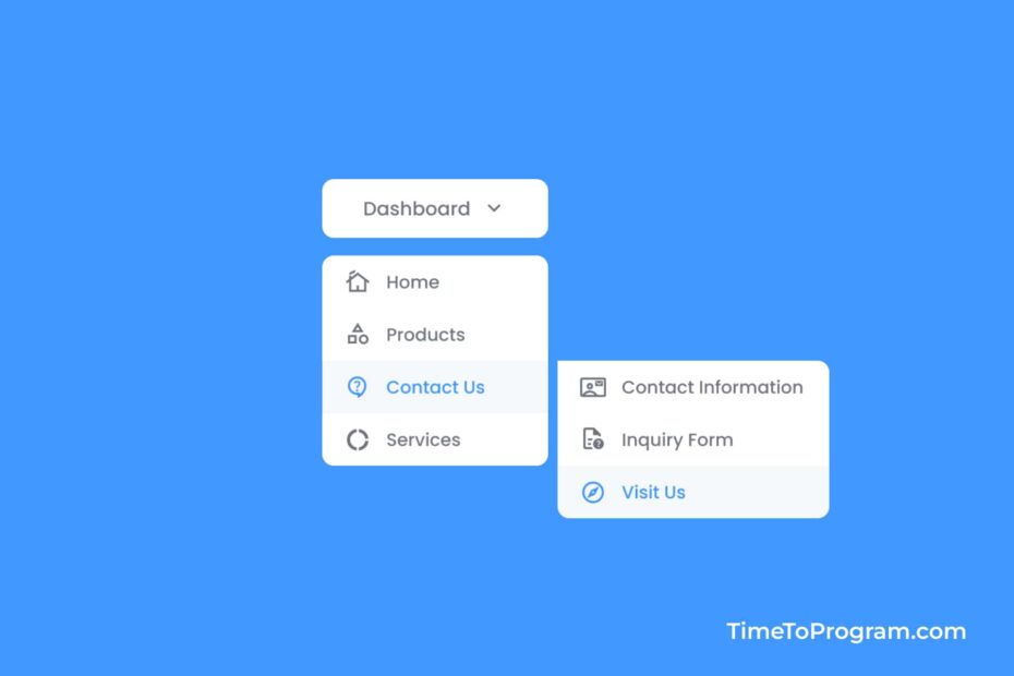
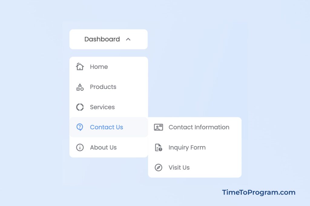
Output:
Conclusion
That’s it, we have successfully created a multi-level dropdown menu using HTML, CSS, and JavaScript. This versatile component can enhance the website’s navigation and organization of content. Feel free to explore further customization options. Hope it was helpful.