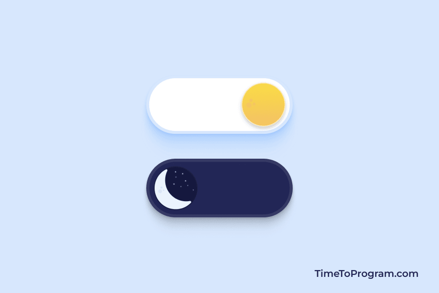
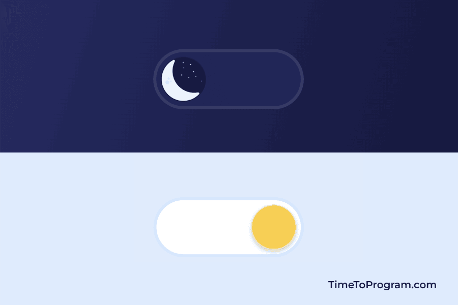
In this tutorial, we will learn how to create a dark mode toggle switch button using HTML and CSS. we usually use a toggle switch button to represent the on or off status of a specific feature or functionality.
For creating a toggle switch button we are going to use the input element of the type checkbox. We make a switch button UI using HTML and CSS then based on the status of the checkbox we update the toggle switch button state (on or off). You can see our custom toggle button output in the below demo video.
As shown in the above demo video, we have our custom dark/light toggle switch button with icons. If the user clicks on it we animate the switch to slide to the right and the sun icon changes to the moon icon. And we are also changing the body background color.
Steps to Create Dark and Light Mode Toggle Switch Button in HTML CSS
- Design a Custom Toggle Switch in HTML
- Style the Toggle Button using CSS
- Animate Toggle Switch Button Based on Checkbox Value
Design a Custom Toggle Switch in HTML
index.html

<!DOCTYPE html>
<html lang="en">
  <head>
    <meta charset="UTF-8" />
    <meta name="viewport" content="width=device-width, initial-scale=1.0" />
    <link rel="stylesheet" href="styles.css" />
    <title>Dark/Light Toggle Switch</title>
  </head>
  <body>
    <div class="container">
      <input type="checkbox" id="switch" />

      <div class="bg-fill"></div>

      <div class="switch-btn">
        <label for="switch">
          <div class="icons">
            <img src="./moon-icon.png" alt="moon" />
            <img src="./sun-icon.png" alt="moon" />
          </div>
        </label>
      </div>
    </div>
  </body>
</html>
Here we have added an input element of type checkbox and for creating a toggle switch we have a <div> with a class name switch-btn inside that we have <label> tag followed by two icons (moon and sun icon).
Style the Toggle Button using CSS
styles.css

* {
  margin: 0px;
  padding: 0px;
  transition: all 0.8s ease;
}

body {
  width: 100vw;
  height: 100vh;
  display: flex;
  align-items: center;
  justify-content: center;
  background: linear-gradient(108deg, #313880 0%, #080b23 100%);
  position: relative;
}

h4 {
  color: #17193f;
  margin-bottom: 20px;
  text-align: center;
  font-weight: 600;
}

input[type="checkbox"] {
  display: none;
}

.switch-btn {
  width: 180px;
  height: 60px;
  background: #212659;
  border: 4px solid #ffffff17;
  border-radius: 50px;
  padding: 6px;
  z-index: 999;
}

.icons {
  display: flex;
  flex-direction: column;
  align-items: center;
  gap: 20px;
  user-select: none;
  color: #17193f;
  transform: translate(0px, 41px);
}

.icons img {
  width: 62px;
  height: 62px;
  object-fit: cover;
}

label {
  width: 60px;
  height: 60px;
  display: flex;
  align-items: center;
  justify-content: center;
  background: #17193f;
  border-radius: 30px;
  cursor: pointer;
  overflow: hidden;
}

.bg-fill {
  width: 20px;
  height: 20px;
  background: transparent;
  border-radius: 50%;
  position: absolute;
  top: 50%;
  left: 50%;
  z-index: -1;
}
Here in the above CSS code, we are hiding the checkbox input element using the display:none property. Added some styles to the switch-btn class, label tag, and icons to make the toggle switch button look good.
Animate Toggle Switch Button Based on Checkbox Value
styles.css

input[type="checkbox"]:checked ~ .switch-btn {
  background: #ffffff;
  border: 4px solid #c3dfffba;
}

input[type="checkbox"]:checked ~ .bg-fill {
  background-color: #ddecfe;
  border-radius: 50%;
  transform: scale(200);
  color: #fff;
}

input[type="checkbox"]:checked ~ .switch-btn label {
  background: #ffffff;
  transform: translateX(calc(180px - 60px));
  box-shadow: 0px 3px 5px 0px rgba(0, 0, 0, 0.2);
}

input[type="checkbox"]:checked ~ .switch-btn label .icons {
  transform: translate(0px, -41px);
}
Added the above CSS to make our toggle switch button work. What it does is if the input checkbox is checked we are sliding the switch to the right, changing the background color of the switch button, and changing the icon. And we are changing the background color based on the status of our toggle button.
Also, check out: